
3 Call to Action Hacks that Increase Clicks and Conversions
Call To Action (CTA), is the part of your content that encourages the audience to do something. Some might say it’s one of the most important parts of your content. CTAs generally help move the reader to the next step in a desired journey. For example they are often used to convert a visitor, or reader into a lead for the sales team. CTAs also drive a variety of different actions depending on your goals. Do you simply want to inform and educate? Are you looking to foster different behavior? Maybe the main objective is to solicit feedback or gather data? Could your goal be to drive urgency to a purchase decision?
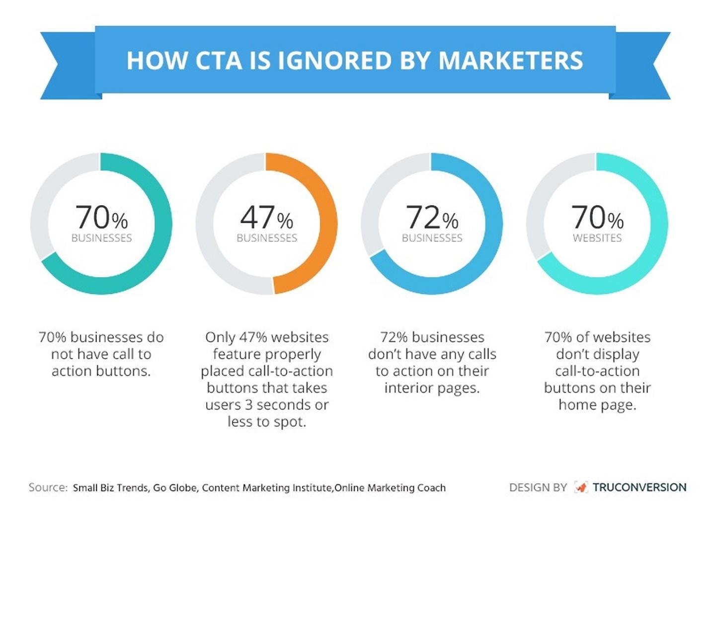
If you are not using CTAs on your pages[1], you are not alone.
There are hundreds of articles on how to improve CTAs. We have selected a few nuggets to highlight the most important improvements you can make. We wanted to share this research with you because let’s face it, we are all short on time and TL/DR applies to just about everything these days.
1. Change your language, be specific:
Humans are efficient to the point of appearing lazy. We filter everything we see in order to find what matters. You are doing that right now[2]! So, understandably all of the known CTAs: Submit, Buy it Now, Click Here to Get Started, and so on have been added to our readers’ filters.
As a marketer or communicator you need to continually evolve your CTAs to skip these filters so they can be seen and acted upon. In order for a CTA to be noticed you now need to change up the language to spark reader interest without being too unconventional (which can erode trust), and, above all, be specific. Specificity is like a mental reward to your users/readers. It gives them an out or a shortcut to the desired outcome which is exactly what they are looking for anyway.
Examples of non-conventional CTAs are “Get Some”, “Where Can I Buy This”, “Show Me a Quick Demo”, “Start My Free Week”, and we like one from Brooks running shoes “Find out when we have more” because it gives the reader something rather than asking them for anything.
2. There Can Be Only One (per screen)
If you give a choice, make one obvious: Meh Choice vs. Better Choice
Research has shown that giving readers choices breaks monotony and makes the CTA much more noticeable. So, write a CTA that feels more like you’re playing a fun game than filling out a boring form or committing to something that might make you nervous.
There is also research that shows that using space effectively can improve your CTA performance. Thanks to using simple design best practices like being aware of “negative space” your call-to-action button will stand out from everything else on the page. You can also use color to connect your value proposition to the CTA.
3. Tie Value Prop to CTA:
Make My Job Easier
Tell your audience what’s in it for them. Tie in your CTA with your value proposition, and give your audience an incentive that motivates them to 5
Use direct, simple language to communicate the value of your CTA in as few syllables as possible, preferably using single syllable words. It should be emotive, easy to say and to understand.
Does your value proposition include how you are different from your competitors? It could. This is an easy and powerful technique to reinforce both. Try something like “Crush Status Quo” or “Show Me Better Options” or “See What’s Next” or “Find Your Next _____”. These must precede a page or demo that delivers on that promise at least in an incremental way, but these phrases can start your readers on a path toward their own changed behaviors.
In case you still need more examples and research, here are some more[3] of the articles we researched for this Pagedip. We love being a guide to help you achieve better engagement with your content!
Ruby, the content gem
Let Me Help You get some Pagedips working for your teams.
Photo credit: Call to action lettering on notepad Premium Photo on freepik
Neil Patel says if it takes more than six seconds to read your CTA, then it’s too long. (BTW, we call this little thing you are reading now a Bink™)
13 CTA Stats to Quantify Its POWER for BRANDS
2021 Inbound Marketing Stats on the Power of Call-to-Action Buttons
17 Best Practices for Crazy-Effective Call-To-Action Buttons